Visualization: Relationships between state indicators
The visualization below creates a scatterplot showing the relationship between two variables in our State Indicators Database. All data are for 2023. Select two variables using the drop-down menus (one for the horizontal [x] axis and one for the vertical [y] axis). The blue circles that appear in the plot are states (you can identify them by mousing over them). The line in the scatterplot is a “best fit” line, and it represents the average relationship between the two variables you select. Note that not all variables in our state database are available in the drop-down menus.For more information on these measures, see our State Indicators Database user’s guide and our annual report. You can also download the full dataset.
Note: if you get an “unexpected error” message when attempting to load the Tableau visualization, try enabling third party cookies in your web browser.
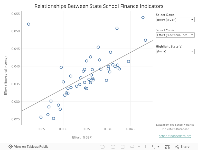
Visualization by Bilan Jama and Lauren Schneider
Latest News
 UPDATED ANNUAL REPORT, PROFILES, AND DATASETS AVAILABLE
February 2026: Read the eighth edition of our annual report, view your state’s one-page finance profile, use our data visualizations, or download the full state-level dataset.
Latest Annual Report
 The Adequacy and Fairness of State School Finance Systems (8th edition)
The eighth edition of our annual report presenting findings on effort, statewide adequacy, and equal opportunity in state school finance systems. Published February 2026.
Latest Research Briefs
 State School Finance System Profiles (2022-23 school year)
One-page profiles summarizing the key results on effort, statewide adequacy, and equal opportunity for all 50 states and D.C. View your state’s profile. Published February 2026.


Copyright © 2022-2023 Albert Shanker Institute | All Rights Reserved